Charles Spencer Anderson

Charles Spencer Anderson was born in Minneapolis Minnesota 1958.He graduated from Minneapolis College of Art and Design in 1981 and by 1985 had joined the edgy Duffy Design group where he became a parter. He was influenced by a curious mixture of mid-century New Bauhaus Modernism, which he was exposed to by his teacher and first employer, Peter Seitz. He also enjoyed canivalesque pop culture which he learned by studying design history.
In 1989, with only a single client, the French Paper Company, Anderson formed ,Charles S. Anderson Design. Anderson’s promotional campaign for the company, with its hybrid vintage type and iconography—he called it “the bonehead style”—comically critiques the ubiquity of these passé materials, thinking of them as valuable artifacts, not just kitsch novelties.Anderson had revived cartoony printer’s cuts and turned it into a graphic achievement. In popularizing these forms, Anderson also contributed to design culture by building on 'American commercial folk art'.
Why I like his work:
I like his work because they show a cartoony side while also being vintage and modern. I like how he uses bold colours and the way he uses words in a sort of comic book font. I also like how he uses uncommon objects like whales and tanks, and puts words or uncommon designs near or in them. His work does remind me of the past and what my parents would have experienced seeing in art.
I also like how he doesn't only do pages of design but also logo's and plates, called pop ink. In one of his pictures he put 2 presidents of the united states and was making fun of them. I like how he had humour in his art and how he tried to show pop culture in his work.
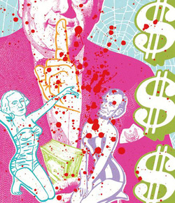
This is called Politically incorrect.
This has two USA presidents at the bottom in dresses, and he is obviously making fun of them for how they ran politics and the country.
This has two USA presidents at the bottom in dresses, and he is obviously making fun of them for how they ran politics and the country.

This piece is from the pop ink, french paper collection. This is a whale with other fishes around it. The whale is defined in black while the other creatures are less defined in white with the blue background. The creatures are outlined and not fully colours in.

These are plates from his Pop Ink collection called Doo the Dishes.
I like these plates because they have a nice design and they have wonderful colours. I personally would like to own these ;)
I like these plates because they have a nice design and they have wonderful colours. I personally would like to own these ;)
This is from the French Paper collection.
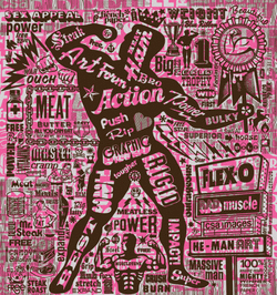
This shows a muscle man in a pink background with dark brown words and words cut into the pink background. The words describe men, and how they act, (Rigid and Flex -o).
This shows a muscle man in a pink background with dark brown words and words cut into the pink background. The words describe men, and how they act, (Rigid and Flex -o).

This impacts a tank with the cartoon script in blue saying, 'BANG BOOM and FLASH.' He used a white background and back for the tank colour to make it pop out.
Paula Scher

Paula Scher is an American graphic designer born on October 6th, 1948 in Washington DC. She works in identity design, packaging design, Publication design and environmental graphics. She has a BFA from the Tyler School of Art and a Doctor of Fine Arts Honoris Causa from the Corcoran College of Art and Design
She has also been a principal in the New York office of the distinguished international design company Pentagram since 1991.
She began as an art director in the 1970s/early '80s. In 1998 she was put into the Art Directors Club Hall of Fame, and in 2000 she received the prestigious Chrysler Award for Innovation in Design. She has served on the national board of AIGA and was president of its New York chapter from 1998 to 2000. In 2001 she received the profession's highest honor, the AIGA Medal. In the mid-1990s her landmark identity for The Public Theater fused for cultural institutions. Her graphic identities for Citibank and Tiffany & Co. have become case studies for the contemporary regeneration of classic American brands.she has a BFA from the Tyler School of Art and a Doctor of Fine Arts Honoris Causa from the Corcoran College of Art and Design.Scher has developed identities, packaging for a broad range of clients that includes, among others like The New York Times Magazine.
Why I like her work:
I like her work because of the colours she uses and how her work is simple, but elegant at the same time. I especially like her logo designs because they are simple yet appealing to the eye. These are also companies which are popular.
I like her work because of the colours she uses and how her work is simple, but elegant at the same time. I especially like her logo designs because they are simple yet appealing to the eye. These are also companies which are popular.

This is a logo for a jewellery company.
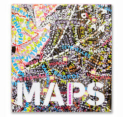
The cover of Paula’s MAPS—which features 39 paintings, drawings, prints, and environmental installations—unfolds into a poster

This is the windows 8 logo. This is a well known logo since all PC's are installed with windows 8.
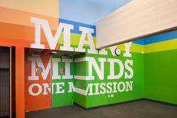
This is the environmental graphics designed for Achievement First Charter school in Clinton Hill, Brooklyn.

Environmental graphics for Bloomberg L.P.’s headquarters located on the east side of Midtown Manhattan
Stefan Sagmeister

Stefan Sagmeister was born in 1962, Bergenz, Austria and is an Inspirational and intriguing designer. He is recognized for his unorthodox, provocative designs that tweak the status quo and question the designer’s role in society.
He began studying graphic design at the University of Applied Arts in Vienna (earning him an MFA), and was taught by Paul Schwarz (a disciple of A.M. Cassandre). In 1987, he arrived in New York City to attend Pratt Institute on a scholarship where he got his Master’s degree.
At 29, he attained a job with Leo Burnett, working at an ad agency in Hong Kong and soon became an important figure in the agency, and got his first taste at the opportunity to choose which clients he would work with. He also did a brief stint in Sri Lanka, which landed a job at M&Co. in New York City. In 1993, Sagmeister Inc. focused on commercial work for the music industry. Since then, they have designed graphics and packaging for clients such as Rolling Stones and Aerosmith. Sagmeister’s work for bands has received four Grammy nominations, and has won nearly all the international design awards available.
Why I like his work:
He is my favourite out of the 3 designers that I chose. I like his unique way of making art and how he uses things that you wouldn't usually think of using in graphic design picture, like pennies for the words or fabric. He is very unique and his designs are new and eye-catching. they relate to the popular culture very well and I love the different images he has created by using simple things. He also uses various backgrounds for his pictures., from floors to trees.
He is my favourite out of the 3 designers that I chose. I like his unique way of making art and how he uses things that you wouldn't usually think of using in graphic design picture, like pennies for the words or fabric. He is very unique and his designs are new and eye-catching. they relate to the popular culture very well and I love the different images he has created by using simple things. He also uses various backgrounds for his pictures., from floors to trees.

The words are made from pennies and they are in the floor

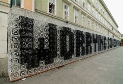
Aizone campaign design
This is made from glass cubes stacked on top of eachother
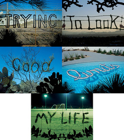
These were made in different areas of public or residential places.

Here for Good by Stefan Sagmeister
